Statistics Graphs — The Ultimate Cheat Sheet for Junior Cycle Maths
Choosing the right graph is one of the most common exam questions in Junior Cycle maths — and one of the easiest places to lose marks. This post breaks down each graph type, when to use it, and the mistakes that catch students out.
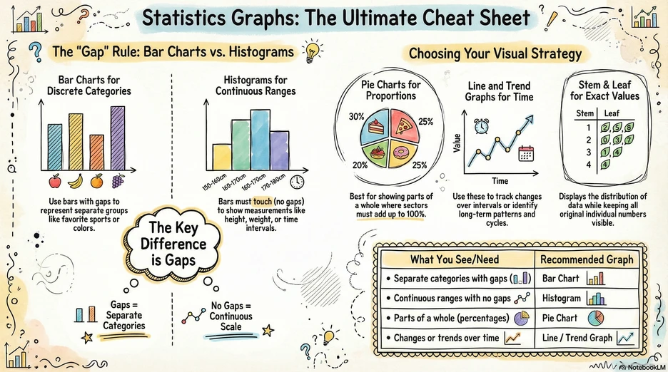
The “Gap” Rule: Bar Charts vs. Histograms
The single most important thing to remember about statistical graphs is the gap rule. It tells you whether to use a bar chart or a histogram.
Bar Charts
Used for discrete (separate) categories — the bars have gaps between them.
Example: Favourite sports in a class → separate bars for football, basketball, swimming, etc.
Watch out! The gaps show that the categories are independent — you can’t have a value “between” football and basketball.
Histograms
Used for continuous ranges — the bars touch (no gaps).
Example: Heights of students grouped into intervals like 140–150 cm, 150–160 cm, 160–170 cm.
Watch out! Histograms look like bar charts, but the no-gap rule is critical. If your data is measured on a continuous scale (height, weight, time), you need a histogram. Drawing gaps would be wrong because the data ranges flow into each other.
The Key Difference
- Gaps = Separate Categories → Bar Chart
- No Gaps = Continuous Scale → Histogram
Choosing Your Visual Strategy
Beyond bar charts and histograms, you need to know three more graph types and exactly when each one is the right choice.
Pie Charts
Used to show parts of a whole as proportions.
Example: A budget split into rent (40%), food (30%), transport (20%), savings (10%).
Watch out! The sectors must add up to 100%. If your data doesn’t represent parts of a single whole, a pie chart is the wrong choice.
Line and Trend Graphs
Used to track changes over time or to identify long-term patterns and cycles.
Example: Average monthly temperature over a year, or a company’s sales figures over several quarters.
Watch out! Line graphs imply a continuous connection between points. Only use them when it makes sense for values to exist between your data points (like temperature between months). Don’t use a line graph for unrelated categories.
Stem and Leaf Plots
Used to display the distribution of data while keeping all the original individual numbers visible.
Example: Test scores of 23, 25, 31, 34, 37, 42 → Stem 2: 3, 5 | Stem 3: 1, 4, 7 | Stem 4: 2
Watch out! Always include a key (e.g., 2|3 = 23). Without a key, the reader can’t interpret the values. Also remember to put the leaves in ascending order.
Quick Reference
| What You See / Need | Recommended Graph |
|---|---|
| Separate categories with gaps | Bar Chart |
| Continuous ranges with no gaps | Histogram |
| Parts of a whole (percentages) | Pie Chart |
| Changes or trends over time | Line / Trend Graph |
| Distribution with exact values | Stem & Leaf Plot |
Study tip
In the exam, read the question carefully to identify whether the data is categorical (bar chart), continuous (histogram), proportional (pie chart), or time-based (line graph). The type of data tells you the type of graph. If a question asks you to “represent” or “display” data, choosing the wrong graph type will cost you marks even if your values are correct.
This post is based on an AI-generated infographic from Boomanotes — turn any study notes into visual revision aids.